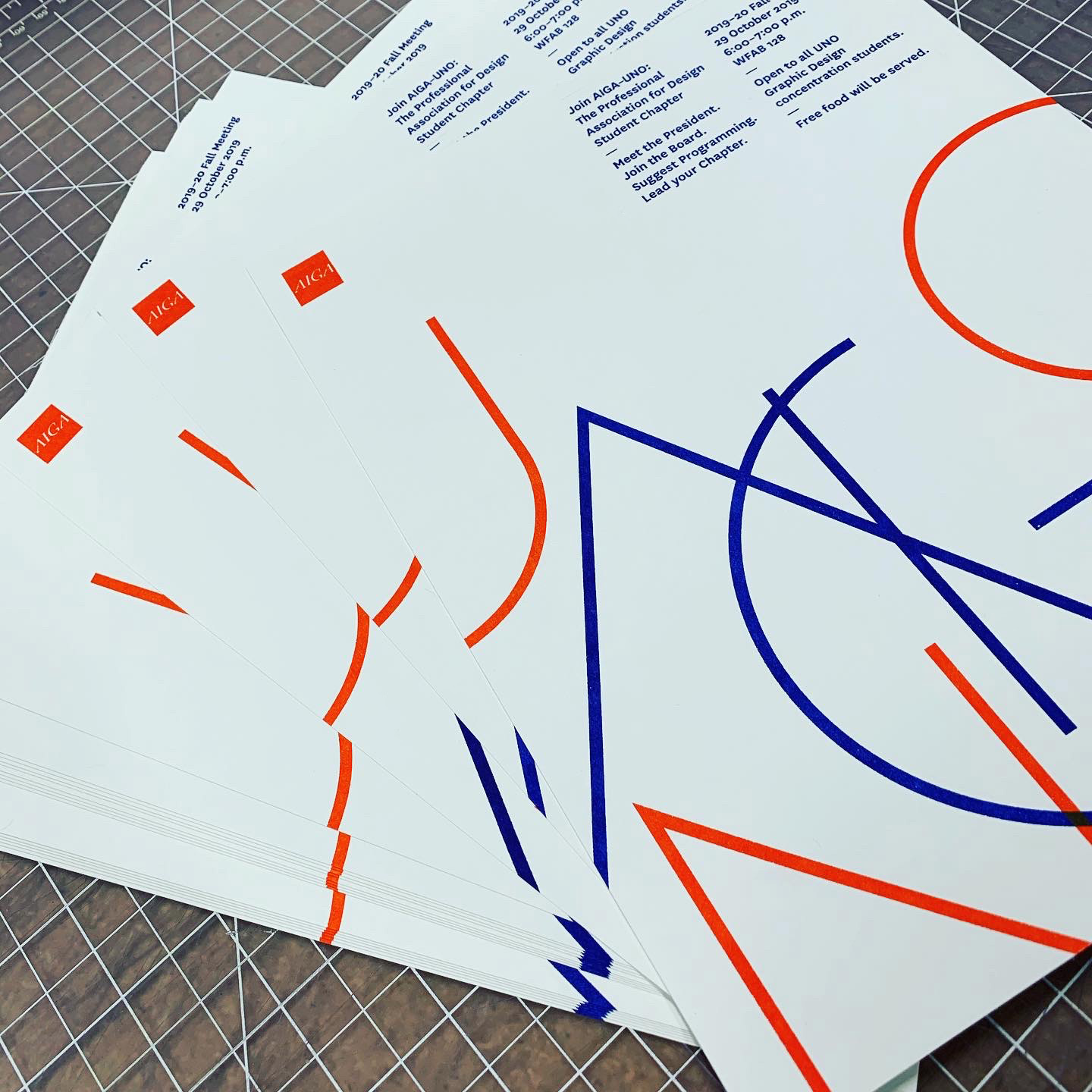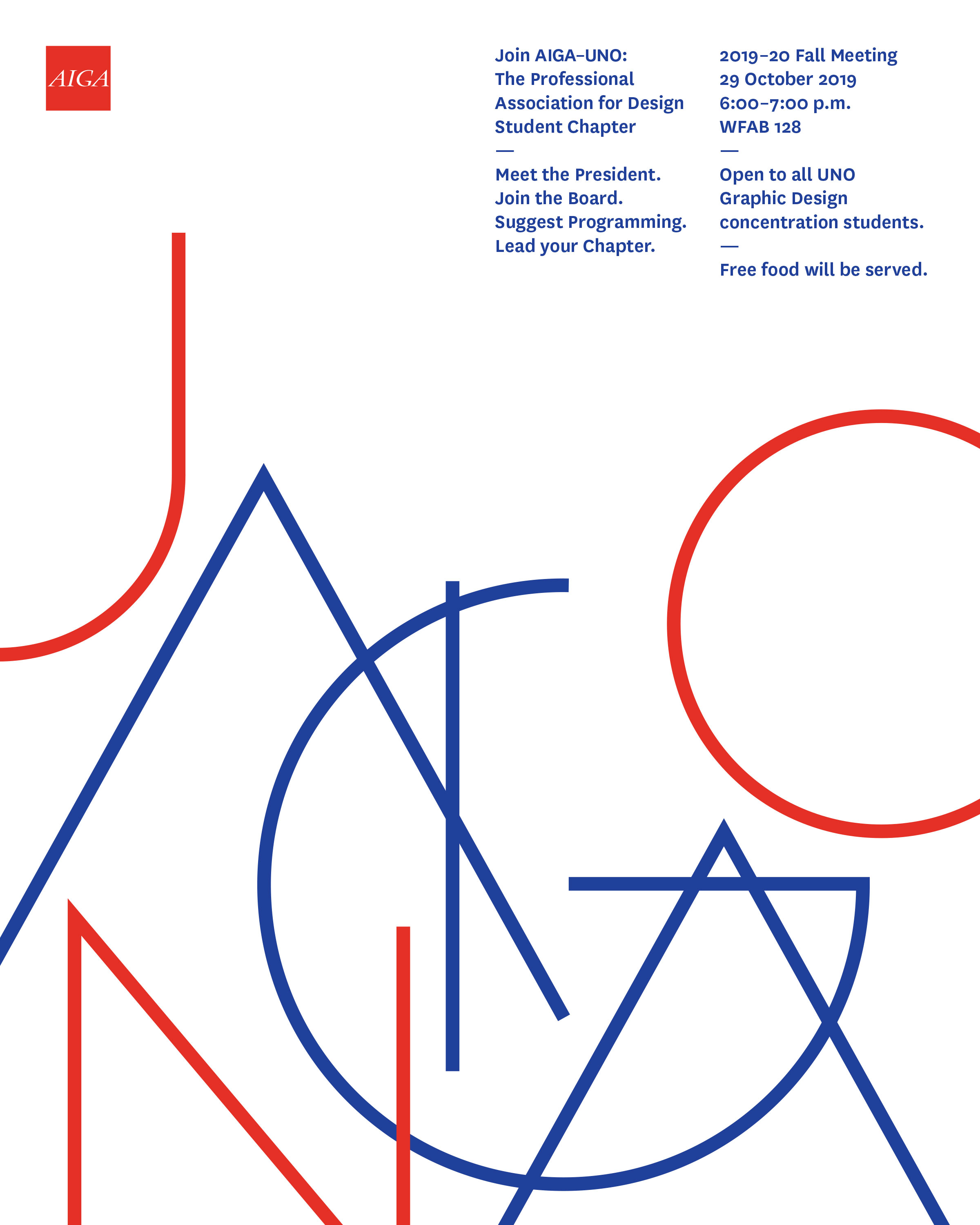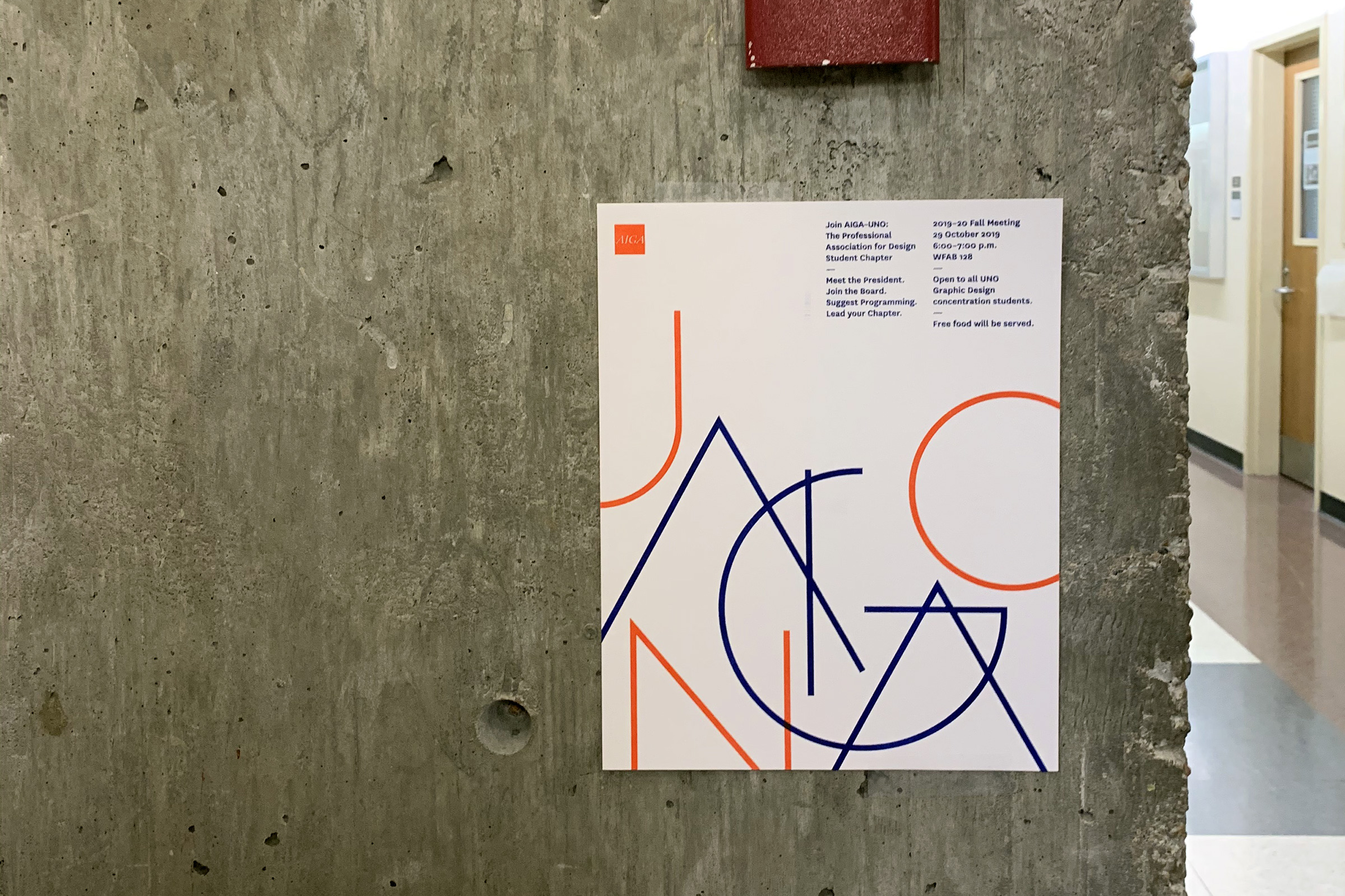
The handbill concept was based on the singular defining the many. Individual letterforms are created with a single, continuous line. Letterforms then overlap and gather in proximity. Color is used to distinguish the linguistic differences and visually encode members and non-members. AIGA members are one color and collectively gathered, while UNO students are a separate color on the edges. Two distinct groups merging in support of communication.

To create the layout structure, a 16-column grid was built from a one-half inch square proportion. The proportion was built from the symmetric proportion defined in the national AIGA logo. Custom letterforms were then placed to sub-divide or relate to column widths.

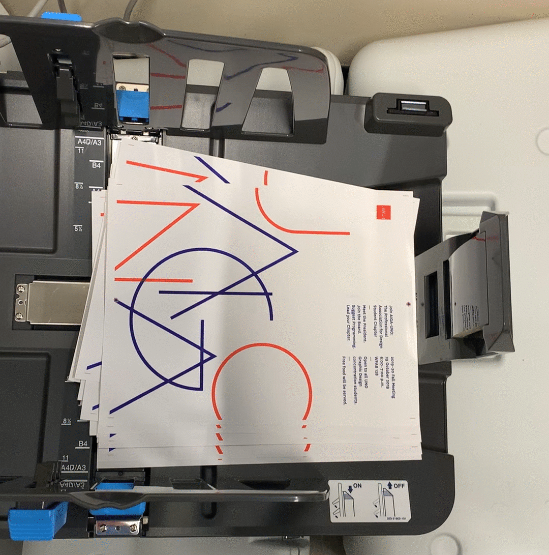
Handbills were printed using photo-reproduction techniques and tools. Using a Risograph and evoking activist distribution—fast, multi-color prints were quickly distributed to engage an audience. Typography-based communication rendered clarity and access.
